Hi there,
Look!
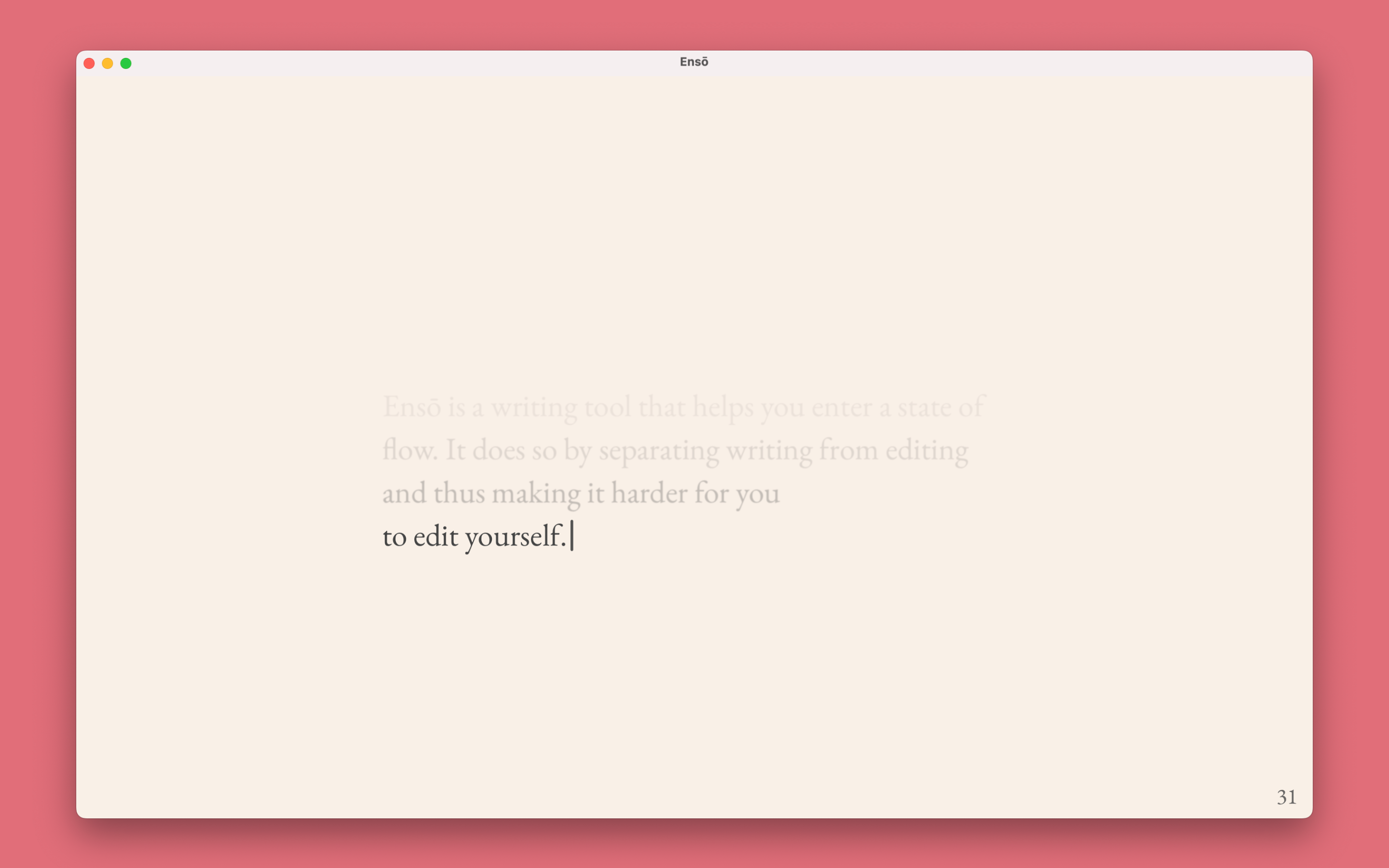
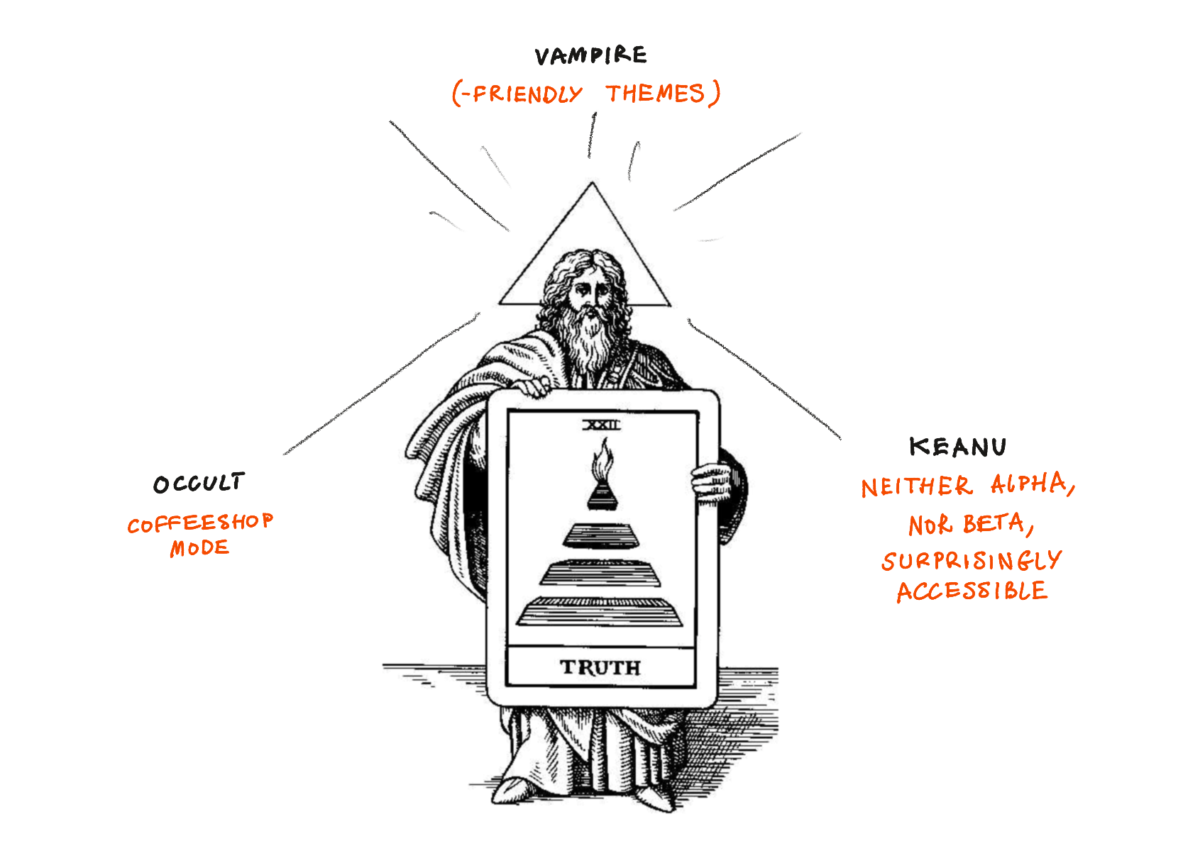
The new version of Ensō (codename: Occult Vampire Keanu) is available for public testing!

This is a temporary icon I used for testing. I am considering creating a simplified version of it. PS. here's the original image (on potato.horse, of course)
What's included
Following MISS, my focus is on removing distractions over adding new features. This can be surprisingly challenging (e.g. how do I tell users about feature X or Y without breaking their flow?) but also gives me time to focus on polishing the app.
(we will discuss these in more detail in future posts)
Short version (as explained by Hermes Trismegistus)
- Simplified, more accessible UI
- Accessible themes
- Coffeeshop Mode
- Privacy improvements
Slightly longer version:
An even more simple, streamlined UI, following the MISS philosophy.
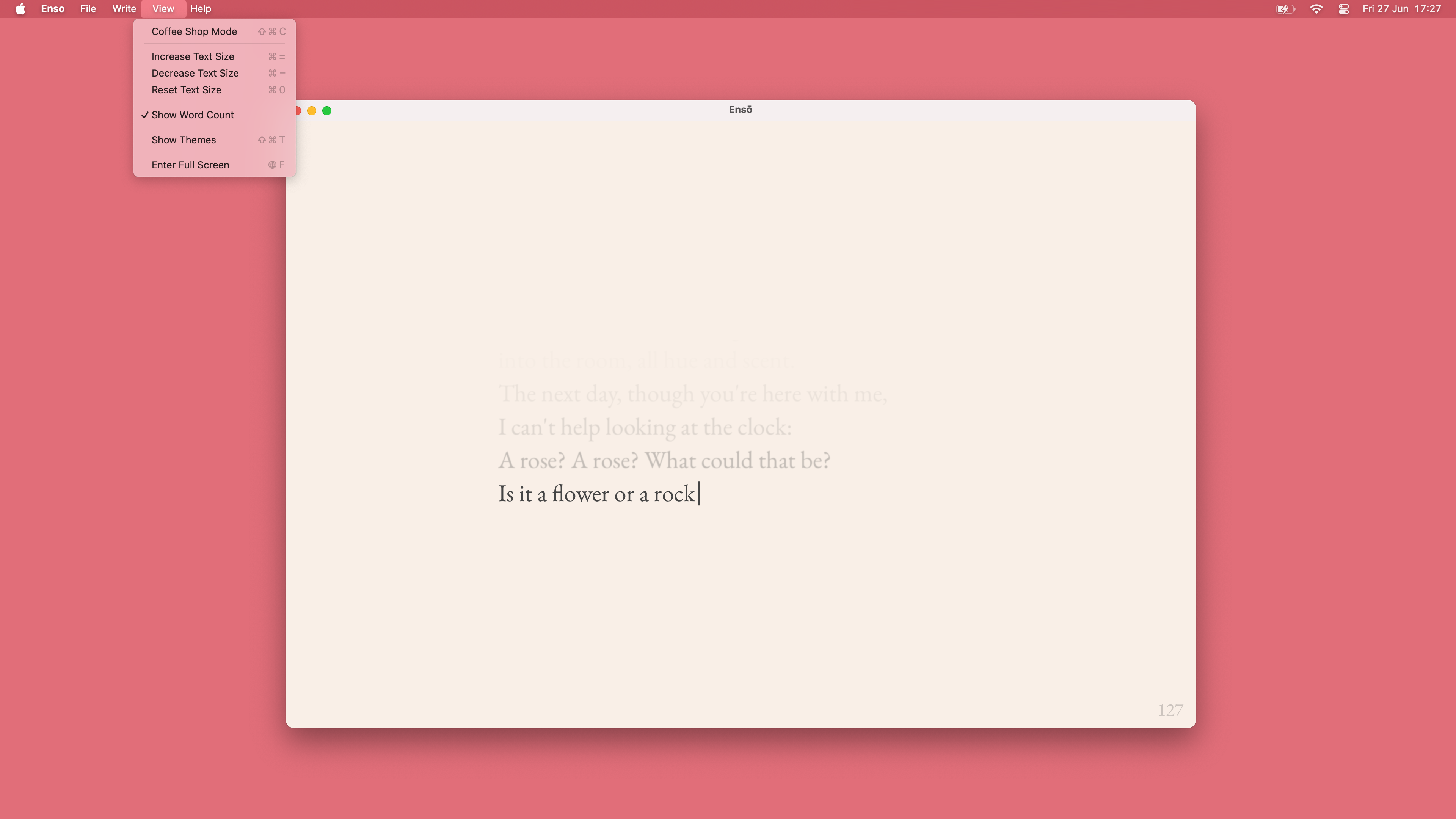
Most of the UI has been moved to the application menu bar for easier discoverability and shortcut access. So far no one has missed the old inline UI, but you can read more about it towards the end of this note.
5½ Accessibility-friendly themes to choose from
We have 6 5½ predefined themes focussed on accessibility and specific use patterns based on feedback I've collected over the years.
- writing during the day in regular light conditions
- writing in bright light
- writing in low light
- writing in low light for devices with OLED screens
- allows for perfect black
- writing in extremely low light conditions, with reduced light exposure (See Midnight, Obsidian for Vampires)
- designed for OLED screens
- the main use case here is writing at night, to put myself to sleep.
5½ and not 6 because one theme still needs some work. Is there a specific use case or theme you'd like to see in Ensō? Let me know!
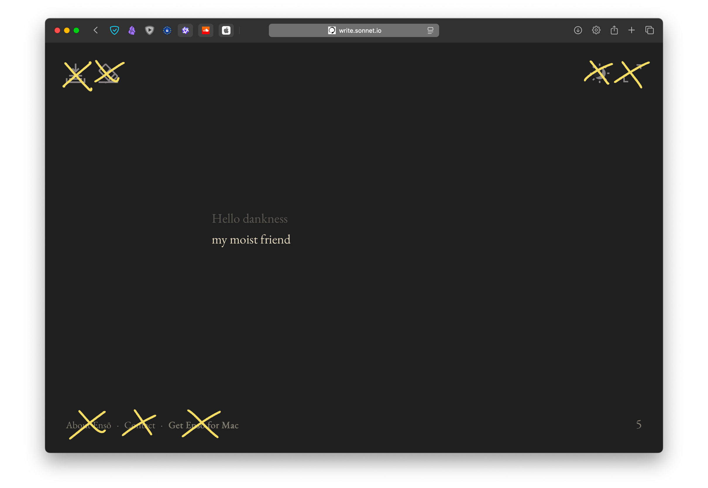
Coffeeshop Mode™
This is one of the few truly new features in Ensō. Coffeeshop mode allows you to stop worrying that someone standing behind you might see what you're typing. The text itself is concealed but you still know what you're writing. Use ⌘-C to toggle on and off at any time.
I've been using it for a couple of months and found it super helpful, especially for journaling in public places, but not only (read more here: Sketch - Ensō Coffeeshop Mode).
A few smaller accessibility improvements
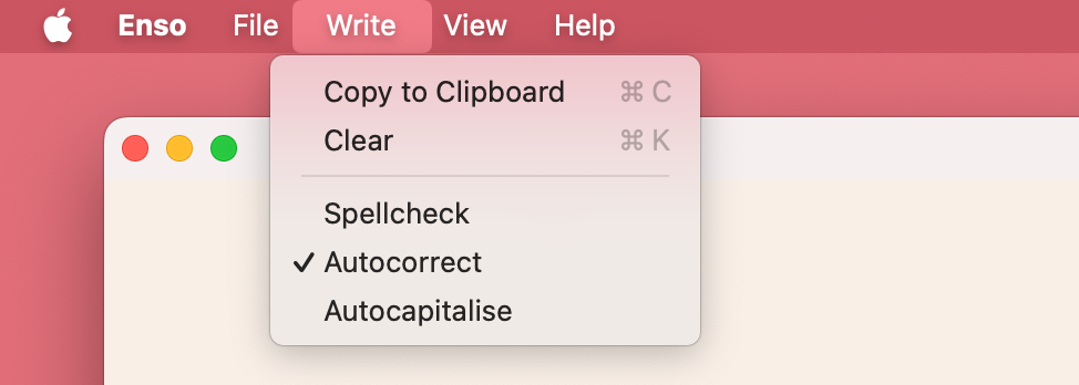
Note: if you remove the Edit menu and call it Write, MacOs won't add its AI crap to your settings.
- toggle autocorrect, autocapitalise, spelling
- control text size (previously not possible in the native version)
A new, polished text rendering engine
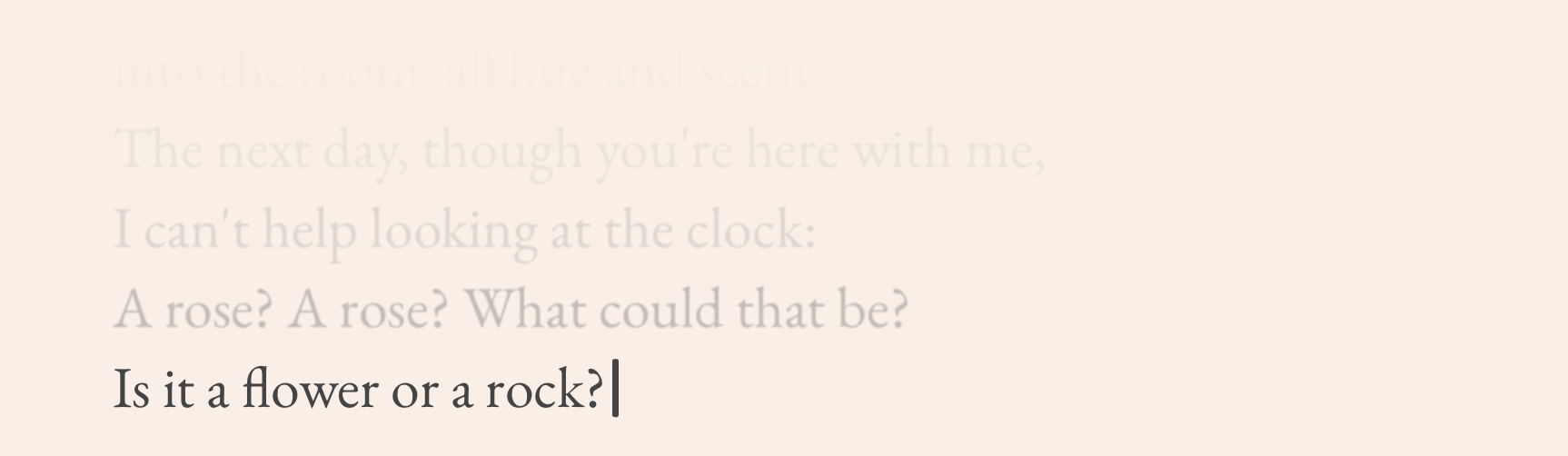
The new text rendering engine allows for better control over typography settings, supports alternative display modes like Coffeeshop, and uses a custom caret.
I don't know how to describe it objectively (and I obviously lack the distance to) but writing in the new UI feels different, more fluid. The text is easy to read, but also somewhat softer (though not blurry).
Less is more, so why do I care about it? Because less is more. I want Ensō to feel familiar and high-quality, like a good Moleskine notebook. I want people to feel comfortable paying $10 for a typing app without text selection. I want them to enjoy it as much as I do. Fewer features allow me to focus more on what is there.
AppStore by default (but standalone versions are still coming)
Ensō will be published via the AppStore by default. We will keep the old version on Gumroad, but there's no reason to maintain it, since the new version is better in every possible way and functionally the same by default.
The reasons I decided to skip the AppStore and use Gumroad, plus what I learned from that are beyond the scope of this note (you can click the link to request that particular write-up).
Why?
- several users complained that Gumroad payment looked, for the lack of a better word, shady, especially at the step with a PayPal payment screen. The ones who messaged me still bought the app, but I imagine there were many who turned back.
- AppStore with all its flaws makes delivering apps... slow and annoying, but also relatively easy without much code.
- I can add OTA updates and re-publish Ensō via Gumroad later, which makes sense as an iterative improvement.
The Gumroad version of Ensō will stay as a backup, but will not be maintained.
What's not included
Analytics
I've been using Ensō daily for 6 years. I've also received a ton of high-quality feedback, not via analytics but from users who were kind enough to reach out to me. I like to think that I have a fairly good idea of how and why people use Ensō.
The previous version of Ensō would pass an anonymous impression event on load. Now, by design, no network traffic is made at all. Here's our new Privacy Page.
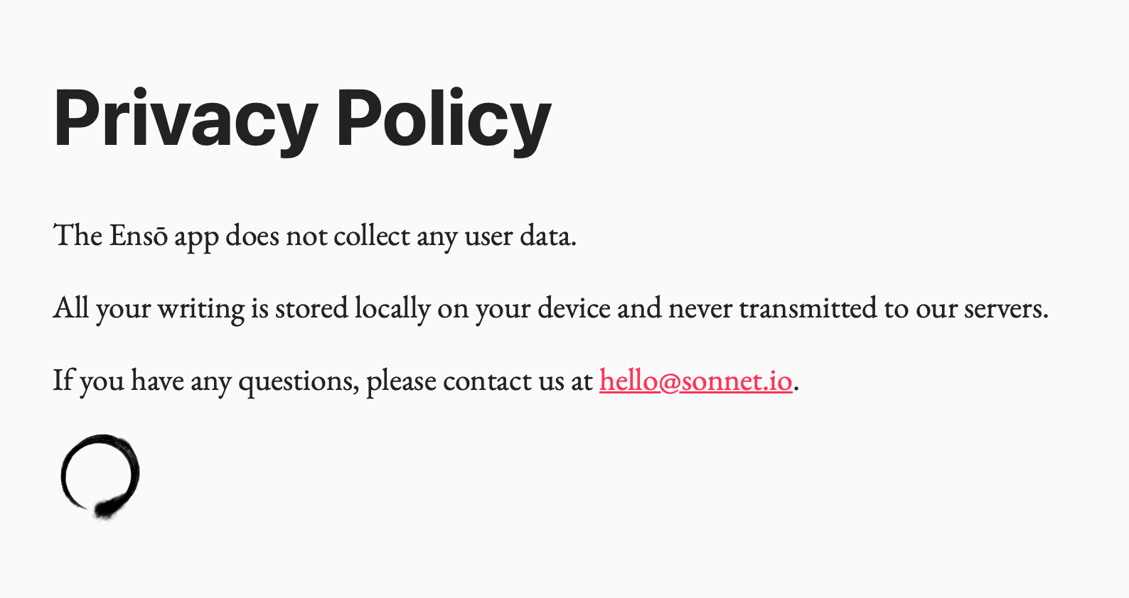
Current version of our Privacy page (source)
Related How I Use Analytics With My Indie Projects and Defaults Matter, Don't Assume Consent
Personalisation
It will come, but the new version is already so much better than the previous, that I feel like waiting for more features would be a wasted opportunity.
I'm working on a UX that balances discoverability with staying focussed. Each option, each new choice is a chance for you to get distracted, so the key is to do this thoughtfully and with respect towards my users' time.
RTL (or non-LTR) language support
This one will be included in the next test build. Many Ensō users speak languages written in non-Latin alphabets (to my knowledge, mainly Persian, Arabic and Hebrew).
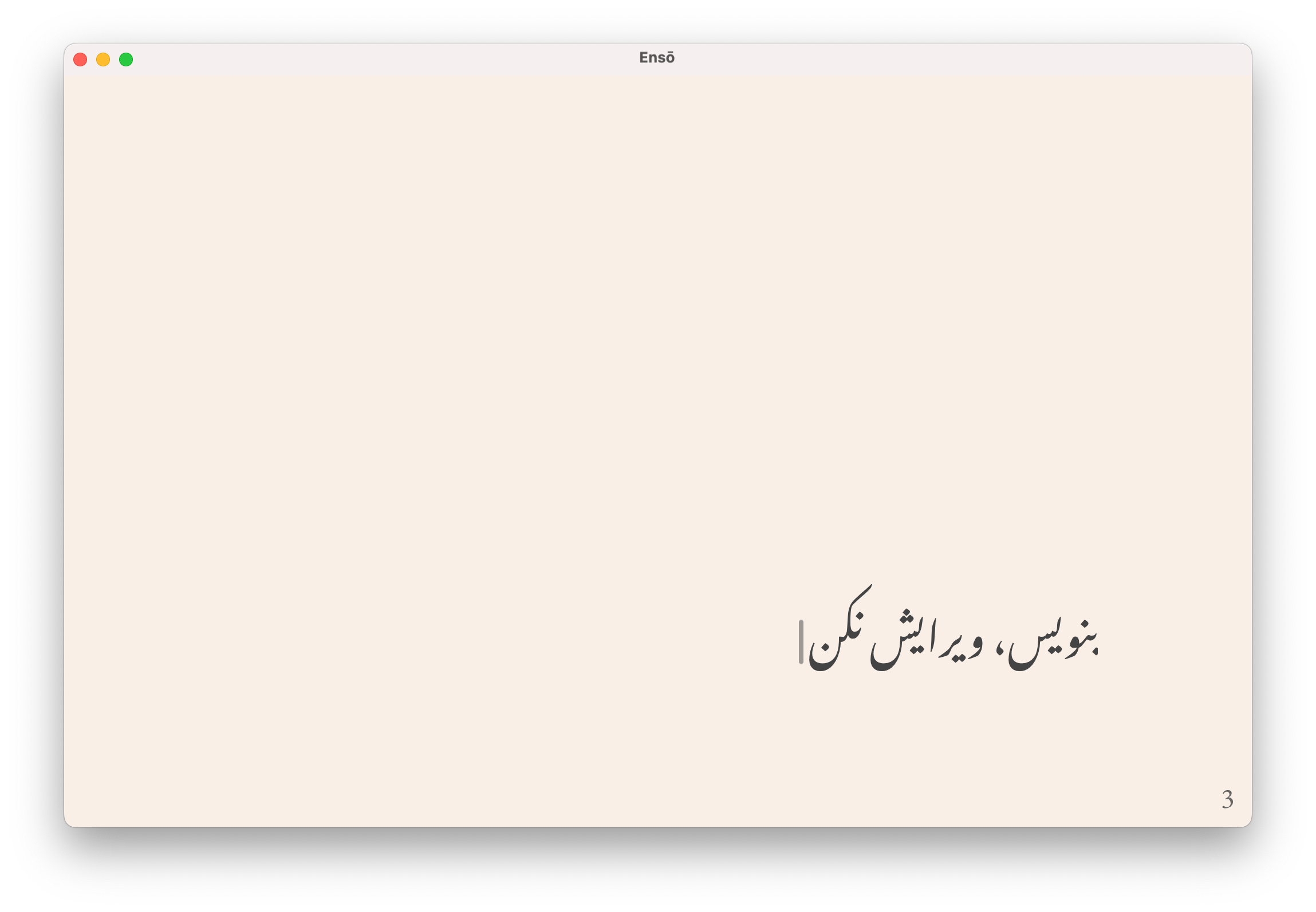
It makes me both grateful and somewhat sad that one (non-techie) user went as far as even sharing a code sample with me when asking for fixing the issue. Adding rudimentary RTL support can be as simple as a one-line change in your code. Even if it's not perfect - it's still a huge improvement that your non-Latin script users will notice, believe me.
More inline editor UI
The previous version of Ensō displayed the UI in the same space as the text. That's not the case any more.
I'm still considering adding a hamburger menu in the main app canvas, however only two (less frequent) users of Ensō have brought it up so far.
What I care about more:
- ease of use, reducing distractions
- the software should get out of your way (Kind software)
- discoverability
- familiarity
There's tension between 1. and 2. as every new feature implies more choices on the user's part; every new choice is an opportunity for distraction. This might seem pedantic, but small, seemingly insignificant changes do add up.
Removing things is harder than adding them (see 3.). Perhaps that's why commits with negative LoC count feel so good.
What's next
Where to go from here?
- Collect the test feedback and respond to it
- Prepare basic marketing materials
- I might put an ad on social media, trying to get people off it (Sit.) but what I call marketing is mostly talking about Ensō and related subjects here, plus engaging with communities I already know, such as forums
- Add RTL writing support
- Launch
Ideas I'm considering
- Windows and Linux support — I'll revisit it in the next few months. I'm moving towards supporting myself from my own projects and I need to be selective how I use my time. If you're interested in testing a Windows or Linux build, let me know.
- Quick Save - hitting
⌘+Swould automatically save a snapshot of your notes to a predefined directory with a time-stamped file name, e.g.note-27-06-2025.txt - Toybox - an optional menu feature with experimental tools released episodically, such as:
- writing prompts
- writing timer
- visual experiments (e.g. different typography styles or letters and words turning into vines that grow as you type)
If Toybox becomes a reality, it'll be buried in the menus to avoid distractions and will act mainly as my platform for experimentation and play with users. If there's a chance it might introduce more distractions - it'll become a separate app. (Kind software)
How I worked on this
Every day in small chunks and some days in longer stretches.
I'm approaching this just like My Recent Art Exhibition - working on different things simultaneously, focussing on their interplay rather than looking at each feature in isolation.
While I believe you should Share your unfinished, scrappy work, I know Ensō well enough that I can allow myself more flexibility. This style of work gives me a lot of joy and the end results have so far been better than expected.
What I've learned
The new Ensō is not the type of project I can share in small unfinished bits, feature by feature. I will repeat this ad nauseam: I want to give you something that will get out of your way but also feel beautiful, polished, yours.
This is akin to good typography or UX - when it's there, you don't notice it, but at a subconscious level, you feel more comfortable with the tool and want to spend more time using it. That has been my experience so far.
Tauri is much more mature than when I released the first macOS version of Ensō. I spent weeks getting the previous version to build properly on Mac with notarisation, provisioning profiles and undocumented AppStore Connect APIs. Now, most of the things just work (sometimes with a bit of scripting, which is where Claude Code turned out to be indispensable).
I'm not an "IndieHacker", I'm not in a rush, I'm a wannabe-carpenter (Brief History of Galician Carpentry) and Ensō happens to be made of stuff that can be worked in a carpentry-like manner. The small feature set means I can afford to take time to work on this with enough care, which I hope shows in the final product.
Building a theme switcher can be a weirdly complex problem (if you complicate it well enough). The difficult part was letting users set themes for dark/light/sync with OS mode, with previews, making it obvious when changes are saved, all in a single piece of UI, with max 2-3 clicks.
Most of my attempts at this resulted in something that looks more than the Dwarf Fortress GUI than a simple theme picker. I understand now why almost no one is doing this and why the few who do split the UI in several steps.
I'm still happy with using a browser as the text rendering engine. Especially with Safari, the amount of control over typography is just excellent (e.g. text-box: cap alphabetic).
I wish there was an easy way of getting the native accent colour from the OS, but that's not possible at the moment. accent can be customised, but not read.
I'm not planning to remove the free web version of Ensō. I want to get paid for my work, but people reach out to me and buy it with virtually no marketing. I'm hopeful, even optimistic that the trust I've earned so far, as well as the quality of the final product, will be enough for it to grow slowly but steadily.
That's all for today. Thanks for reading!
 Did you enjoy reading this article? Consider