What
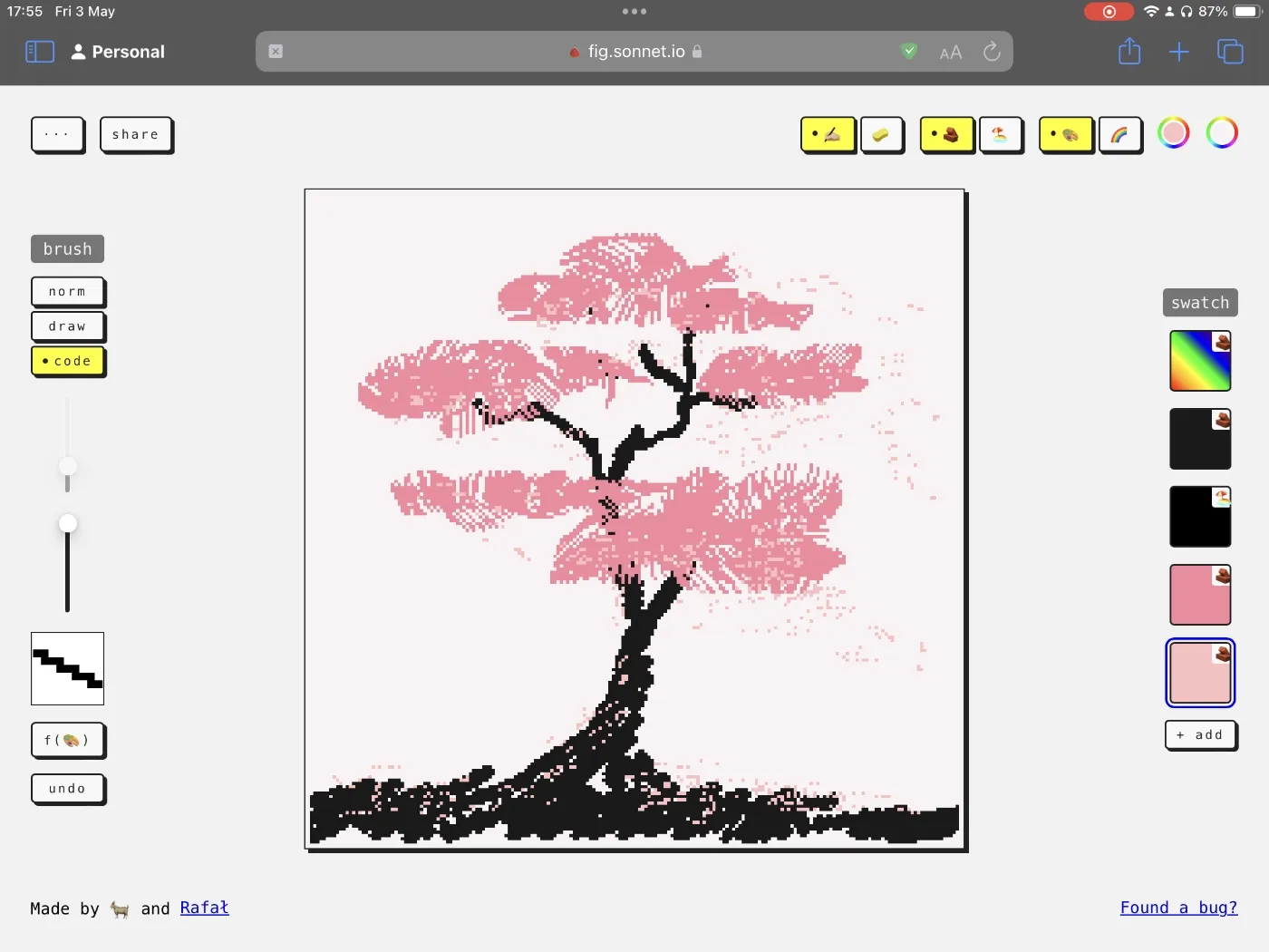
Fig is a drawing app that helps you focus on the process of drawing without obsessing with the end result.
Check it out here.
(works best with desktop and iPad)
Here's how it works: in Fig, every pixel has a lifespan. Over time, all the pixels die and parts of your drawing will fade away.
Want to know how to build a graphics editor that is not capable of keeping pixels on the screen? Here is what I focussed on:
- finding ways to make impermanence enjoyable
- set the right expectations from the beginning (turns out things disappearing from the screen isn't a very peaceful and meditative experience)
- quick or messy drawings still feel and look enjoyable
- playfulness
- make it accessible, make it feel like a toy
- drawing itself (i.e. literally dragging the finger/pen on the screen) should feel fun
- balancing flexibility and a recognisable aesthetic
- the tool is the medium, so make it highly customisable, even hackable
- inspiration: game engines, my dad (a carpenter) making his own tools, Galician Carpentry
What Fig is not
Fig is not a sandbox simulation app (e.g. sandspiel.club). It's a toy, but its primary use is doodling. In fact, I avoided researching sandboxes while I worked on Fig because they are just so much fun to play with and hack (cue: 💧 Top 9 Ways To Make Water).
Features
Pixel lifespan
Every pixel will die after anywhere between 1-240s. You can control the lifespan of each brush stroke separately, or that of the entire drawing. It's up to you.
This does affect undo: if you bring it back to life, you'll get to watch it fade away immediately. I'm sorry — although necromancy is allowed, it is ineffective.
Custom brushes
There are three types of brushes:
- normal → draw a (slightly noisy) rectangle
- drawable → draw the shape of the brush on a 9x9 matrix
- code → control your brush tixy.land style!
I've had so much fun with 2. and 3. so expect a more detailed write-up soon!
Materials and fills
Materials
Materials are simple: there's a wall and sand. Wall stays in the same place. Sand falls.
There's no bucket fill, just a bucket of sand you can pour into a shape:
I played with sand instead of a standard flood fill because:
- using sand is a bit harder than using a bucket fill (Constraints mean focus and the freedom to break them.)
- it just feels fun to use! (also, I wish I could come up with a sound effect for it)
Under the hood, I'm using simple cellular automata and it's really tempting to make these rules more clever. But, I want to make sure that the process of drawing is itself fun and accessible (remember #What Fig is not).
Fills
You can select a single colour or a rainbow-like gradient. And if you change the material, the pixels shimmer a little bit:
Why I made it
I wanted to make a new toy, and a fig tree died. Also, Coding Train released a new video about cellular automata at the beginning of this year.
How I made it
I built a quick and dirty prototype and kept using it almost every evening before falling asleep. I didn't force myself to stick to a routine: I played with it when I felt like it. Dogfeeding is useful, but the felt like it part even more so: most of the ideas implemented in the app come from those evening doodling sessions.
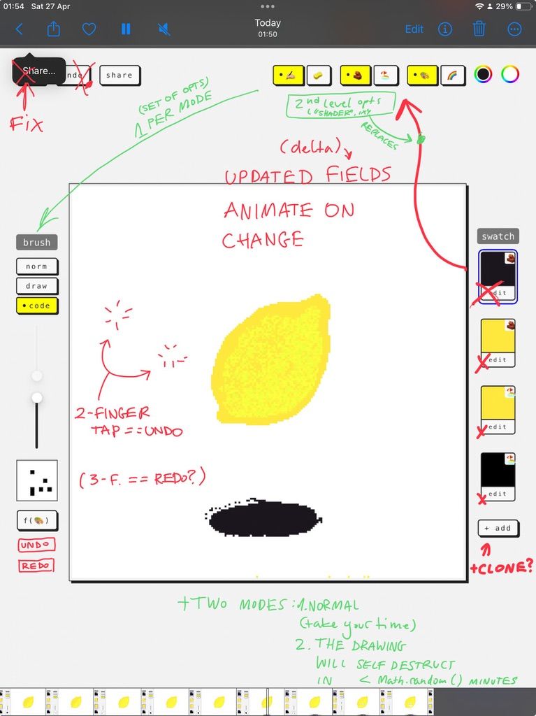
Related: 2-2-2 Project Scoping Technique, Share your unfinished, scrappy work
Tech
I'll try to keep this moderately low on tech, but feel free to message me if you're curious about the details. Here's a rough technical timeline:
- Spike in p5.js
- Move to React + Typescript when managing UI state in p5.js gets too messy
- Add tests when I realise that I spend too much time debugging and catching missing grains of sand in the simulation
- refactor, improve performance once we've had a test coverage
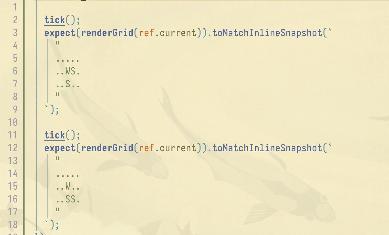
Testing with ASCII art
Balancing prototyping and technical improvements is inherently risky and annoying in hindsight. I'm somewhat less annoyed about this one, but I'm not yet sure why.
How I use Fig
I play in and with it:
- I doodle almost every evening
- I treat it as a platform for testing smaller toy ideas
1. is pretty self-explanatory. It's fun and the results border on trip visuals, but I've noticed that recently using Fig in the evening has replaced my regular drawing sessions. The result is that I have fewer drawings to share. That's probably not a good thing for me, but also a fairly isolated problem.
2. is more interesting, because I'm starting to see how I could break and remix some of parts of Fig into different projects. This brings us to:
Next steps
Smaller improvements:
- make it mobile friendly. I'm using Fig on my computer and tablet. It works really well with iPad + Apple Pencil, but the UI on mobile is too cluttered.
- hide the lifespan. When you start the app you're presented with 2 modes:
- default: start drawing and control the lifespan of each brush stroke
- flow: you don't control the lifespan and you don't know how long the pixels will live for (I'm particularly excited about this one)
- control the animated gradient fill colours
Ideas to explore:
A simple 3 colour pixel art editor inspired by this drawing:
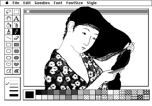
by Susan Kare (context)
SSS
A programmable SSS (Simple Silly Shader) graphics editor where both brushes and fill can be controlled using a simple JS snippet.
A rhythm-based game
I'm particularly excited about this one, but I'm still looking for a concise way of putting it into words. If you play with the code brushes in Fig, you'll notice that some of them oscillate:
Now, imagine that this oscillation is synced with music (i.e. the shape and size of the brush follows the beat). Your goal is to trace the lines of a drawing while matching their stroke shape and size. The only way to match it perfectly is to draw in time with the music. In other words - by dancing with your fingers!

That's all for today. See you tomorrow!
 Did you enjoy reading this article? Consider