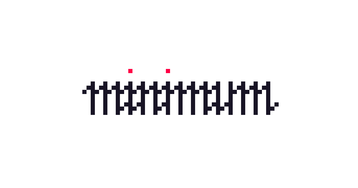
433 is a font that masks visible text and replaces it with dots. I'm using it in the new version of Ensō along with Coffeeshop Mode.
You can see it in action here:
Beautiful.
Why
In short: because it's the simplest way to add Coffeeshop Mode to the app.
(Also, because I was curious)
(OK, mainly because I was curious, Dog mode)
Longer version:
The previous note on Ensō ended up on the front page of HN and gave us almost 400 TestFlight testers. This is way more than I had expected. In fact, I'd initially set the limit at 50 and had to bump it every few hours in disbelief. It's also a relatively diverse group of people with many using non-Latin writing systems, e.g.: Chinese (pinyin), Japanese, Persian, Arabic, Hebrew to name a few.
This posed a perfect opportunity to test:
- a bunch of text rendering and input approaches for IME
- custom carets
- hiding text in Coffeeshop Mode
- a prettier, snappier, and easier-to-style preview.
So, I prototyped a few of them, then settled on a much simpler solution: no need to use Canvas, or wrap each character in a fancy styled <span>. Just make the font render the mystery raisin (·) for anything that is not whitespace.
So, buckle up buckaroos, we're (un)making a font!
Why 433
The name was inspired by 4′33″.
How it works
You can find the script here. But, don't click away yet, we'll go through it step by step in the next section.
What is a font?
To make more sense from this note, let's establish a (grossly oversimplified) Working Definition:
A font is a bunch of glyphs. A glyph is a visual representation, the actual shape of a character, usually drawn as Bézier curves. Each glyph is mapped to an address called a code point. These addresses cover a huge range of characters, supporting various languages, diacritic marks, etc. and are grouped into ranges, e.g.:
- Basic Latin
Range: U+0000 to U+007F
Example characters: standard ASCII – letters, digits, punctuation. - CJK Unified Ideographs
Range: U+4E00 to U+9FFF
Example characters: Chinese, Japanese, Korean common Han ideographs. - Arabic
Range: U+0600 to U+06FF
Example characters: Arabic script letters and symbols.
To reduce size, fonts generally support only a subset of ranges (e.g. Basic Latin). These ranges are grouped into 17 planes of 65k characters each, e.g. Basic Multilingual Plane for most existing languages, Secondary Multilingual Plane for emojis.
Fun fact: There are separate planes supporting hieroglyphs, cuneiform writing, or even 𐬛𐬍𐬥𐬛𐬀𐬠𐬌𐬭𐬫𐬵! Glyphs, planes, and esoteric languages aside, understanding the above and mastering the font-related vocabulary is what distinguishes the Adeptus Exemptus from the Master of the Temple in Thelema. That is, if Thelema were the occult art of font-making.
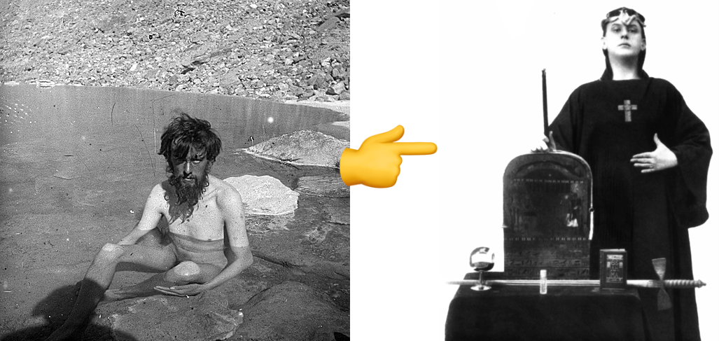
Left: Aleister Crowley during his K2 expedition (1906), right: Crowley in ceremonial garb (1912), source.
Related: How a Font is Rendered.
We've established the context, so now we can be more explicit about what we want to achieve:
Create a font that for all non-whitespace characters returns a glyph rendering a dot.
Constraints:
- ensure that all code points are covered by the font
- otherwise unsupported characters will be rendered using the OS fallback font which would result in unmasking it
- keep the size small
- the Basic Multilingual plane covers 65k characters, so an unoptimised version would be several megabytes in size
The script
Set up font metadata:
font = fontforge.font()
font.fontname = "Masked"
font.familyname = "Masked"
font.fullname = "Masked Regular"
font.weight = "Regular"
font.encoding = "UnicodeFull"
Initially I tried to reuse an existing, well-designed, multilingual font here instead of creating a new one and then iterate on each of its glyphs. However, none of the fonts were comprehensive enough, which is obvious in hindsight.
Set the font metrics:
font.em = 1000
font.ascent = 800
font.descent = 200
These will help define the "canvas" on which to draw the glyph and control the space occupied by characters on the screen:
Draw the glyph:
dot_width = 600
dot_glyph = font.createChar(0x25CF, "blackcircle")
dot_glyph.width = dot_width
dot_glyph.clear()

pen = dot_glyph.glyphPen()
pen.moveTo((300, 200))
pen.curveTo((350, 200), (400, 250), (400, 300))
# ...
pen.curveTo((200, 250), (250, 200), (300, 200))
pen.closePath()
pen = None
Create whitespace characters and empty glyphs:
whitespace_chars = {
    0x0020: 500,  # Space
	# ...
    0x205F: 250,  # Medium mathematical space
    0x3000: 1000, # Ideographic space
}

for codepoint, width in whitespace_chars.items():
    glyph = font.createChar(codepoint)
    glyph.width = width
This is less relevant for Ensō, and somewhat pedantic, since we're using this font only with Coffeeshop Mode.
Assign a glyph to each available code point:
total_glyphs = 0
# Use Basic Multilingual Plane (0x0000-0xFFFF)
# which covers most common characters
for codepoint in range(0x21, 0xFFFF):  # Start from 0x21 to skip control chars
    # Skip if it's a whitespace character
    if codepoint in whitespace_chars:
        continue

    # Skip the dot glyph itself to avoid self-reference
    if codepoint == 0x25CF:
        continue

    # Create glyph that references the dot template
    try:
        glyph = font.createChar(codepoint)
        glyph.width = dot_width
        # Use addReference instead of drawing - much more efficient
        glyph.addReference(dot_glyph.glyphname)
        total_glyphs += 1
    except Exception:
        # Skip invalid codepoints
        pass
This step is especially important. Instead of drawing the same glyph for each code point we reference the original dot glyph to avoid duplication. This will help reduce the size and build time drastically.
try:
	glyph = font.createChar(codepoint)
	glyph.width = dot_width
	# Use addReference instead of drawing - much more efficient
	glyph.addReference(dot_glyph.glyphname)
	total_glyphs += 1
Generate the font:
font.generate(args.font_output) # normally .woff2
I started with TTF, but the generated .ttf font file was ca. 2.4MB, even with deduplicated glyphs. This is because TTF stores individual glyph definitions plus associated table data for each mapped code point. Additionally, TTF does not support internal compression, so all glyph outlines and tables are stored uncompressed.
On the other hand, WOFF2 stores less data by default, supports brotli compression, and even pre-processes glyph curves to make them easier to squash.
Switching to WOFF2 reduced the file size to 70KB. That's a 97% reduction compared to TTF — brilliant!
What I learned/noticed
Using font stitching as an alternative to font stacks
Here's a problem I know how to solve now:
- your brand font doesn't support Japanese characters
- you need to use it both on the web and in your native app (so, you can't rely on font stacks and fallback fonts)
As long as licensing is not a problem, you can merge the Japanese font into the Latin font replacing only the missing ranges. As long as licensing is not a problem.
I'm obviously missing missing some complexity here, but batch operations or CRISPR-style cutting and pasting glyphs to create new multi-language fonts turned out much easier than I had originally anticipated. The FontForgeAPI doesn't seem scary at all.
Also, on the same day I was working on this, I met a friend for beer who had the same problem, so I could share some of this brain food with them! (or make their life more complicated — time will tell.)
MISS
"minimum" rendered as pixel art / Fraktur
It's weird but also almost always very satisfying to look at code as a reductive medium. I mean, yes, engineers love commits with negative LoC in diffs as much as an anthropomorphised version of Claude enjoys producing piles of semi-random, somewhat useful crap. What was different this time? Making tradeoffs at the product level to reduce complexity, since I'm wearing many hats and I'm building a me-sized product. I want to be able to reason about it. Is it L’appel du vide or Horror vacui? It's neither, it's MISS!
On a personal level, messing with this was a good reminder of how many skills went into getting this done: linguistics, typography, unicode, understanding font architecture/data structures, compression, CSS and font stacks, to name a few.
Since you've read this far, chances are this will resonate: I'm not used to celebrating successes/noticing what I've learned, but instead I just move on to the next thing. This was a good reminder for me to pause for a second, because I learn more slowly if I just keep moving. There's no virtue in moving constantly, if you don't know if you're still heading in the right direction. There's no virtue in running like a headless chicken. (related Vicariously)
Thanks for reading!
PS. This post took waaay longer than I had expected and it wouldn't be possible without the help of our editor-in-chief, Luna.
 Did you enjoy reading this article? Consider