Hi there! This one will be quick. Let's let the code speak for itself for a change.
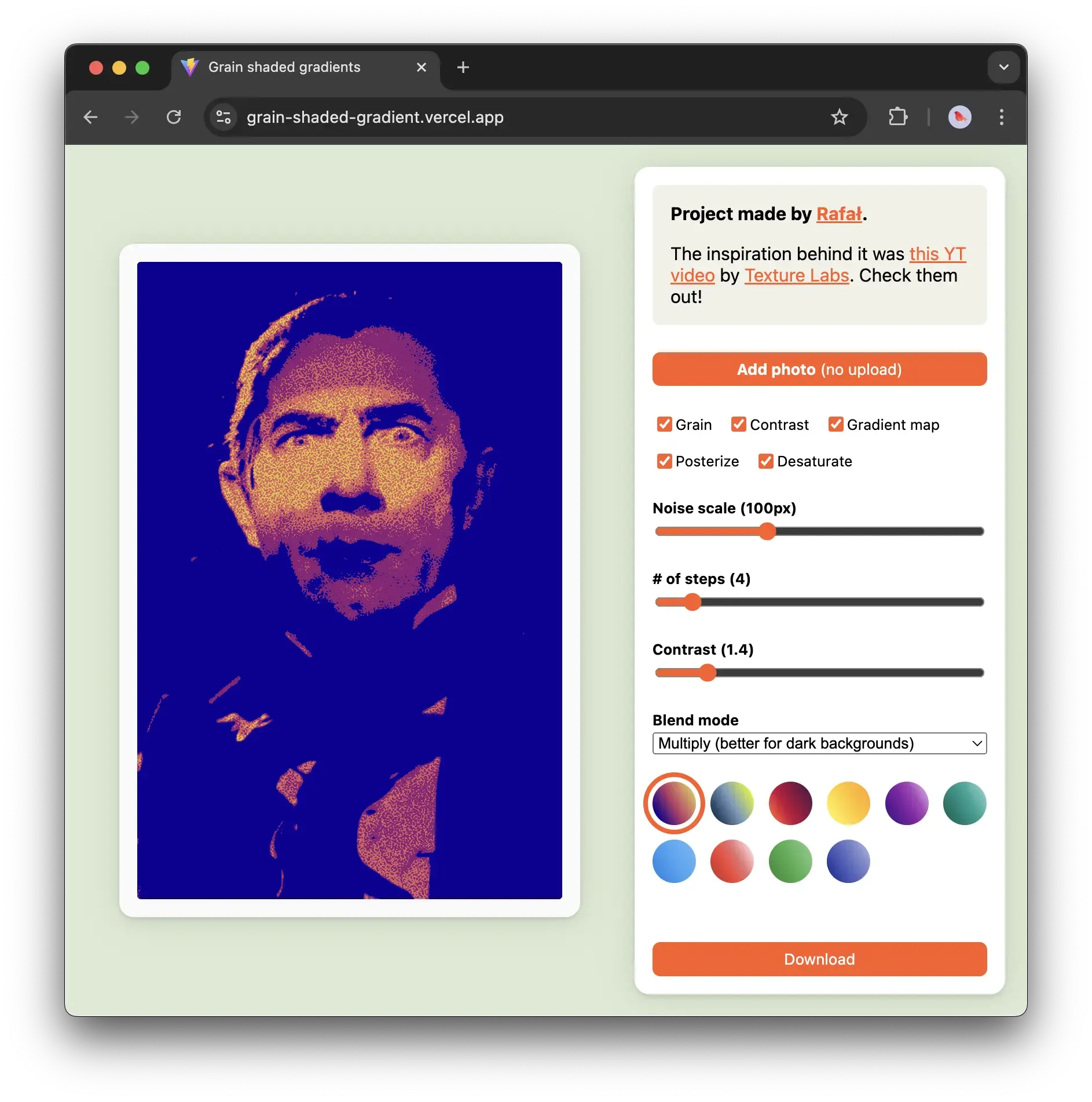
A week back or so I saw a video by a channel called Texture Labs explaining a simple shading technique using gradients, grain and posterise. I thought it would be a fun thing to play with, so here you go. Just Some Innocent Gradient Fun is a simple graphics editor demonstrating the technique mentioned in the video.
Check it out here.
How it works:
The video does a pretty good job explaining the effect itself, so I recommend watching it out for more context. The process boils down to 4 steps:
- desaturate the base image
- apply the noise
- reduce the number of colours to 3-5 steps (e.g. using posterize)
- apply a gradient mask
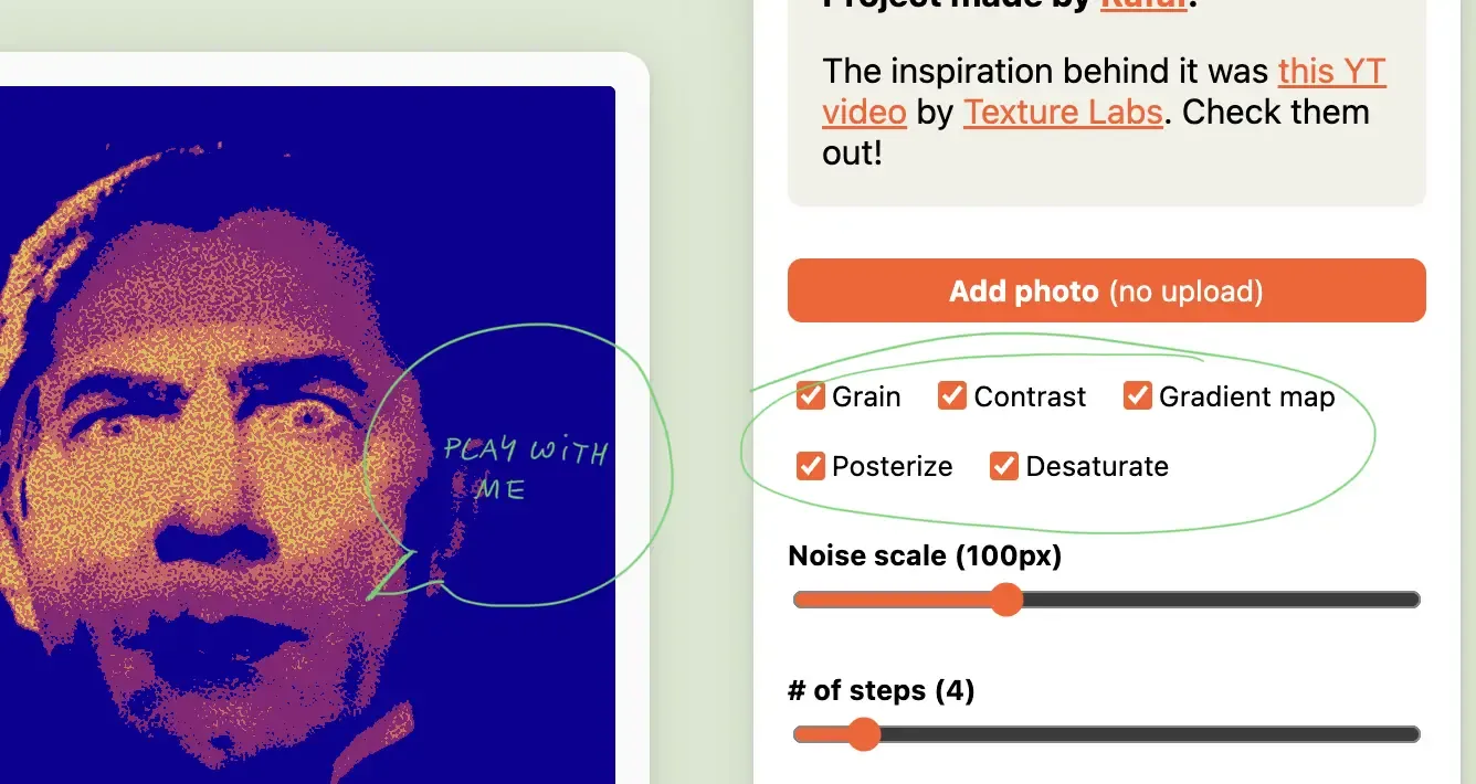
I prefer learning by playing, tweaking, and breaking things. So I added a bit of UI to control different parts of the effect, in case you're similar to me in that regard:
How it works in HTML + CSS
If you're interested in a longer write-up, let me know. Today, we're half-assing things.
In short, the image is wrapped in a bunch of HTML elements called Layers. Each Layer has a filter: url(#some-svg-filter) applied to it. Those #some-svg-filter IDs point to an invisible SVG element with SVG filter definitions.
  <div
	className={styles.layer}
	style={ { filter: 'url("#posterize")' } }
>
	<img ...>
  <svg xmlns="http://www.w3.org/2000/svg" version="1.1" style="display: none;">
    <defs>
      <filter id="posterize">
        <feComponentTransfer>
          <feFuncR type="discrete" tableValues={posterSteps} />
          <feFuncG type="discrete" tableValues={posterSteps} />
          <feFuncB type="discrete" tableValues={posterSteps} />
        </feComponentTransfer>
      </filter>
    ...
    </defs>
 </svg>
In a real world scenario, you could do just fine with 1-2 DOM elements because CSS filters can be stacked. I kept them separate to make the code easier to read and mess with.
What I've learned:
Just Some Innocent Gradient Fun/SVG filter quirks
Next steps:
Not much. This was fun to play with, but I'm trying to me more selective with my time since I have more important things to wrap up this year (like the next version of Ensō!)
OK, there's one tempting idea: creating a web component that wraps an image element to render it in the style of Return of the Obra Dinn or applies a dithering effect like some of the bio entries on this site (Wislawa Szymborska, Zygmunt Bauman).
Why I made it:
(I needed to get out of a rut, and sometimes making useless things helps me get back on track.)
Thanks for reading, see you tomorrow!
Related: Dithering
 Did you enjoy reading this article? Consider